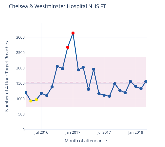
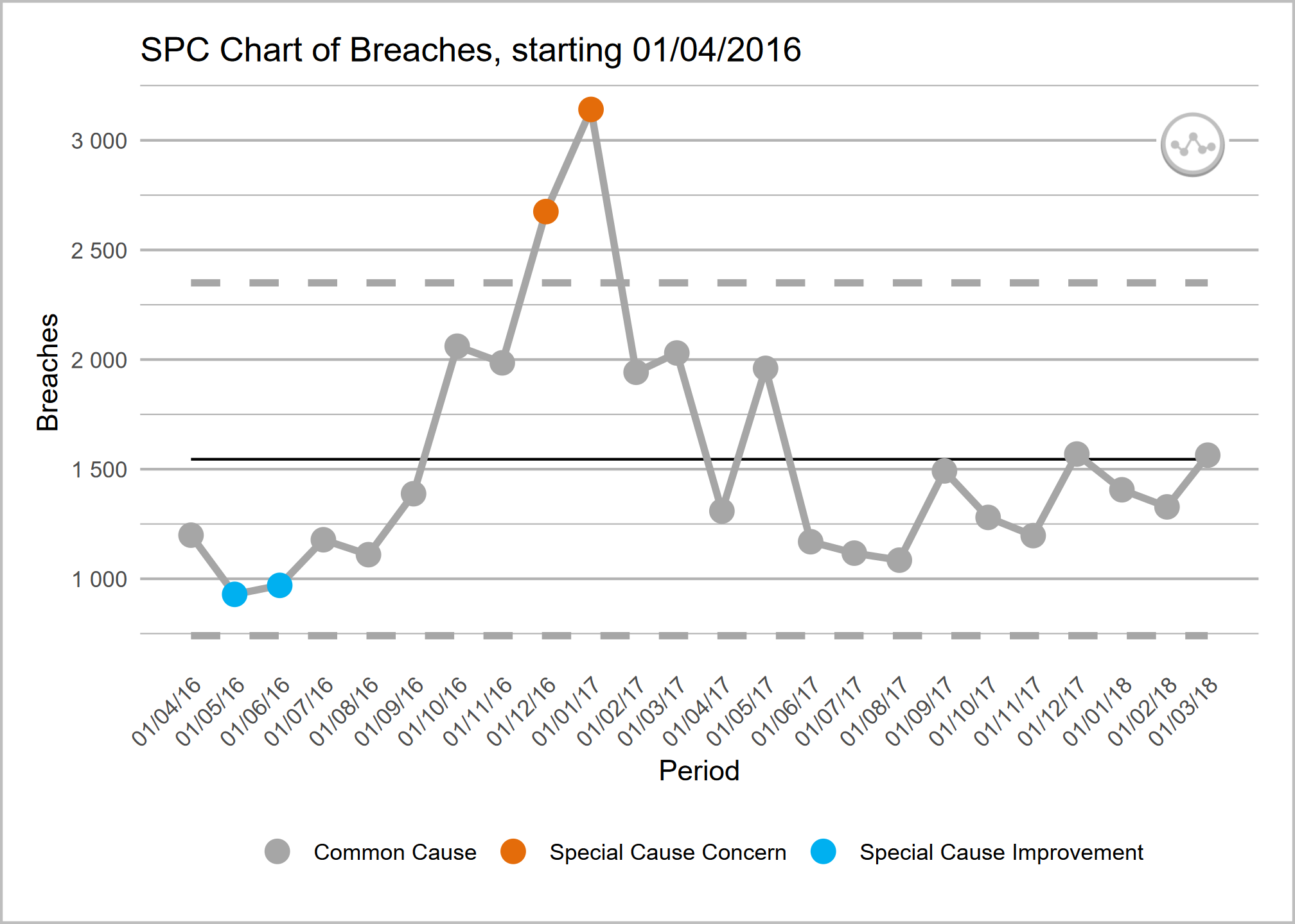
Statistical process control (SPC) charts are a widely well-regarded way to report on KPIs in trusts and other organisations across the country.
SPC charts can help make sense of whether variation in a metric is at a level of concern. By helping to cut through random noise and highlight true patterns of variation, we can move away from ‘spuddling’ - constant meddling that fails to produce real change - and make our reporting more impactful.
SPC charts calculate and display several key pieces of information
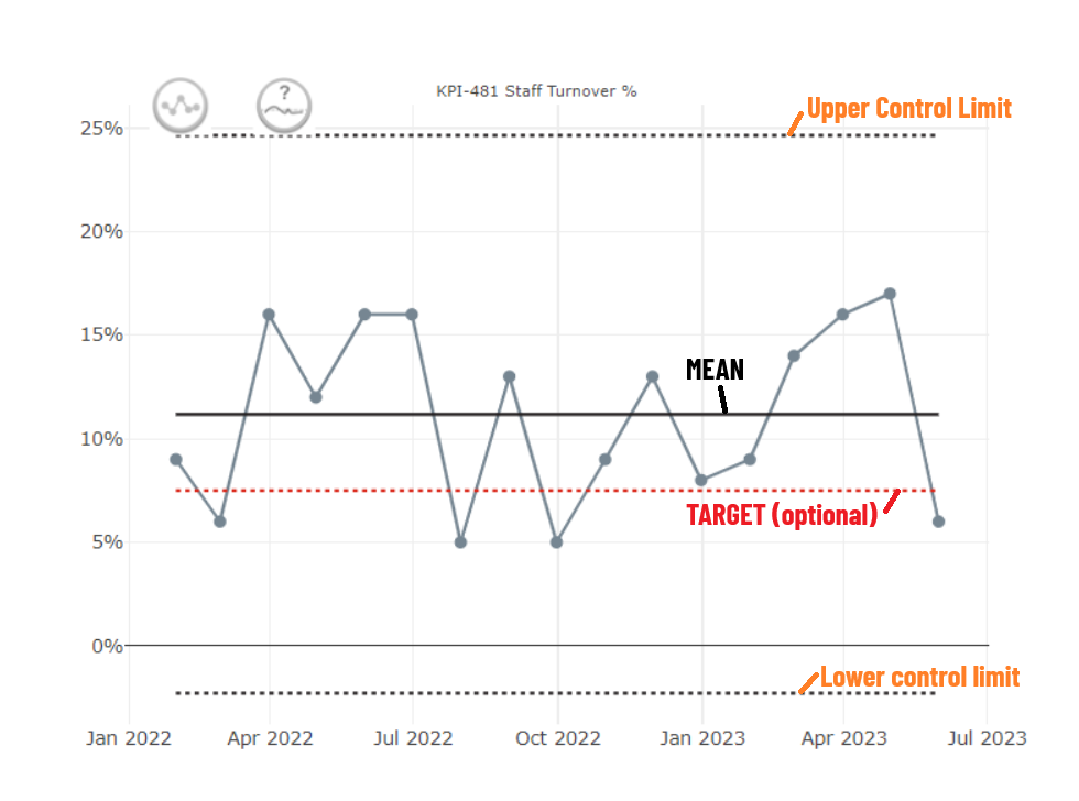
- Mean: the average of all the points (from summing all values and dividing by the number of points)
- Upper Control Limit: This is the mean + 3 sigma
- Lower Control Limit: This is the mean - 3 sigma
They use these limits to distinguish between two kinds of variation
- common cause: normal, natural, random variation in a process
- special cause: unexpected, out-of-the-norm shifts or patterns that are a signal something has changed
Categories of special cause variation are as follows:
- A single point falls outside the control limits (either upper or lower)
- A number of consecutive points all fall above or below the mean line
- this often defaults to 6 points, but it may be adjusted
- Six consecutive points are either all increasing or all decreasing
- Two out of three points fall close to the process limit (within the outer third)
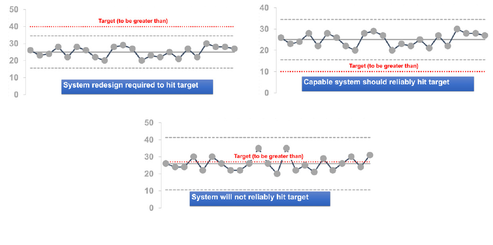
A target line can optionally be included.
- If the target line does not fall within the control limits, this suggests that the system will either reliably meet the target, or not
- If the target line falls within the control limits, this suggests that the target will not reliably be met, as it is expected that the natural variation seen will lead to the values varying around the line
The Making Data Count Programme
This programme ran workshops explaining the principles of Making Data Count and supported trusts with moving to SPC charts instead of RAG reports, and provide lots of training materials.
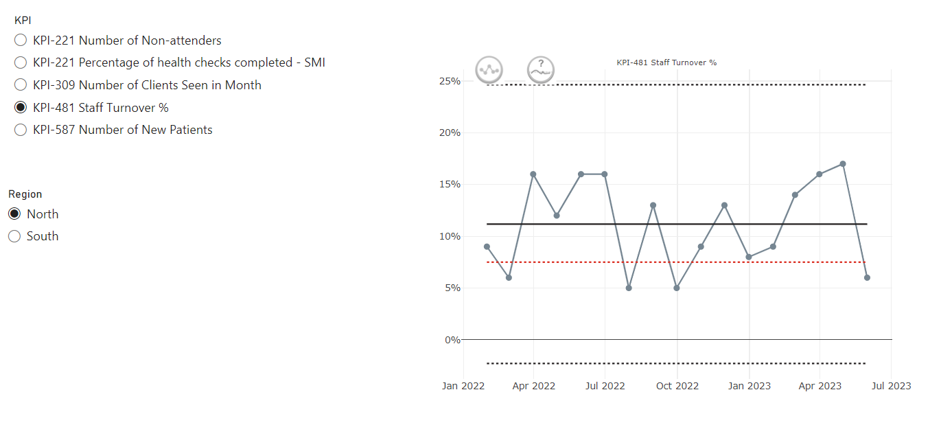
One of the most recognisable parts of the programme are the icons, which have been adopted by lots of users of SPC within healthcare.
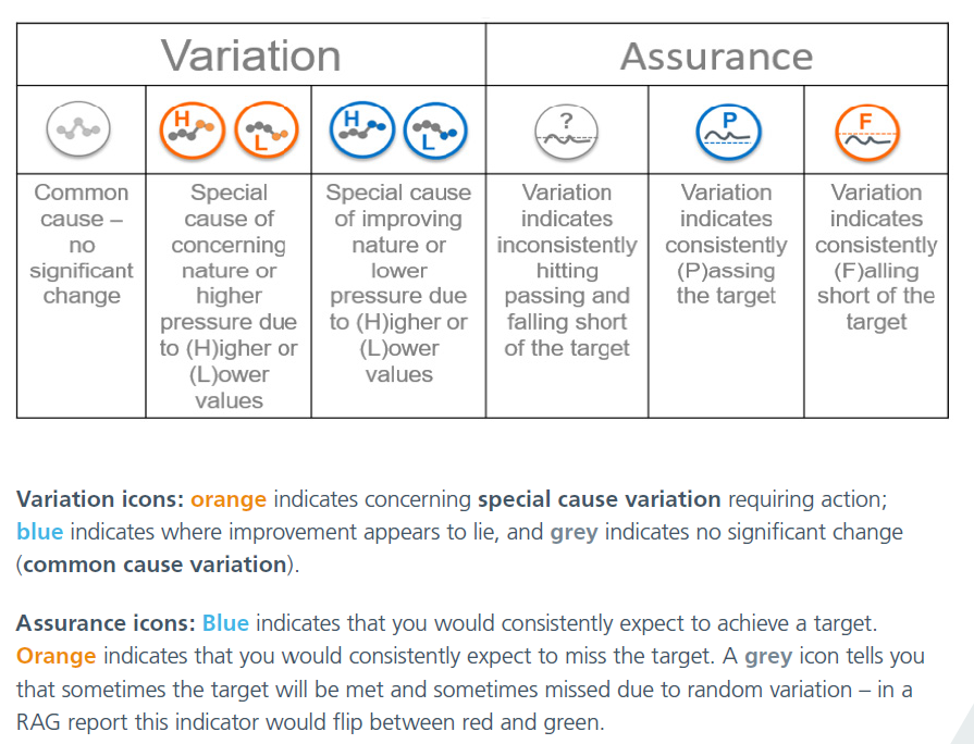
These icons - which will be automatically applied when data meets particular criteria if you are using an NHS-aligned tool to make your SPC charts - can help to quickly pick out areas of concern.
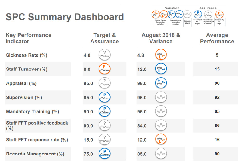
An SPC summary report to replace a RAG rated might look like this. The use of the icons helps to draw attention to the metrics of most concern, and helping to steer people away from worrying unnecessarily about tiny shifts in the ‘wrong’ direction that are meaningless when you step back and look at the data in this way.
Not come across SPC charts before? Read these guides from the NHS England Making Data Count team.
Getting Started
Strengthening Your Decisions
Types of SPC charts
There are actually a wide range of specialised SPC charts for different types of data.
The making data count programme uses only XmR (Individuals & Moving Range) charts regardless of data type, and many NHS-focussed tools and packages therefore only provide the facility to make this type of chart. The MDC programme makes the case that XmR handles almost all types of routine NHS data, and it’s not necessary to overcomplicate the choice of chart.
Some packages - particularly more general purpose SPC charting packages - provide the facility to make these other kinds of charts.
Some other types are as follows:
| Type | Purpose | Why might you use it? |
|---|---|---|
| p-chart | Monitoring Proportions | Greater sensitivity to changes than an XmR chart |
| u-chart | For event rates | |
| c-chart | For counts | |
| g-chart/t-chart | Rare Events |
Other Resources
The book ‘Mastering Statistical Process Control Charts’ in healthcare is under development and can help you to extend your knowledge of SPC charts.
Relevant Packages, Projects and Tools
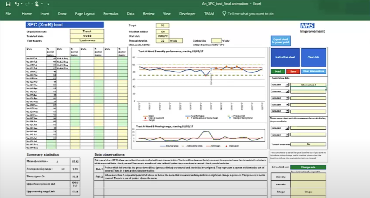
These Excel templates support the creation of statistical process control (SPC) charts adhering to the making data count rules and style. SPC charts are a good alternative to red-amber-green (RAG) rated reporting of metrics, helping to build a more informed picture of a metric's performance over time and spot signals of improvement or deterioration.
This custom PowerBI visual (based on NHSRplotthedots) simplifies the creation and automation of statistical process control (SPC) charts for KPIs. It helps analysts and teams move beyond static KPIs to understand true performance variation and identify opportunities for improvement, producing R-backed visuals within the setting of PowerBI and integrating with PowerBIs data model and filters.
NHSpy-plotthedots is a Python port of the NHSRplotthedots package that simplifies the creation and automation of statistical process control (SPC) charts for KPIs. It helps analysts and teams move beyond static KPIs to understand true performance variation and identify opportunities for improvement.
NHSRplotthedots is an R package that simplifies the creation and automation of statistical process control (SPC) charts for KPIs. It helps analysts and teams move beyond static KPIs to understand true performance variation and identify opportunities for improvement.