These Excel templates, created as part of the ‘Making Data Count’ programme, allow you to create statistical process control charts without the use of any code. Values can be entered into the templates, and there are various parameters that can be tweaked.
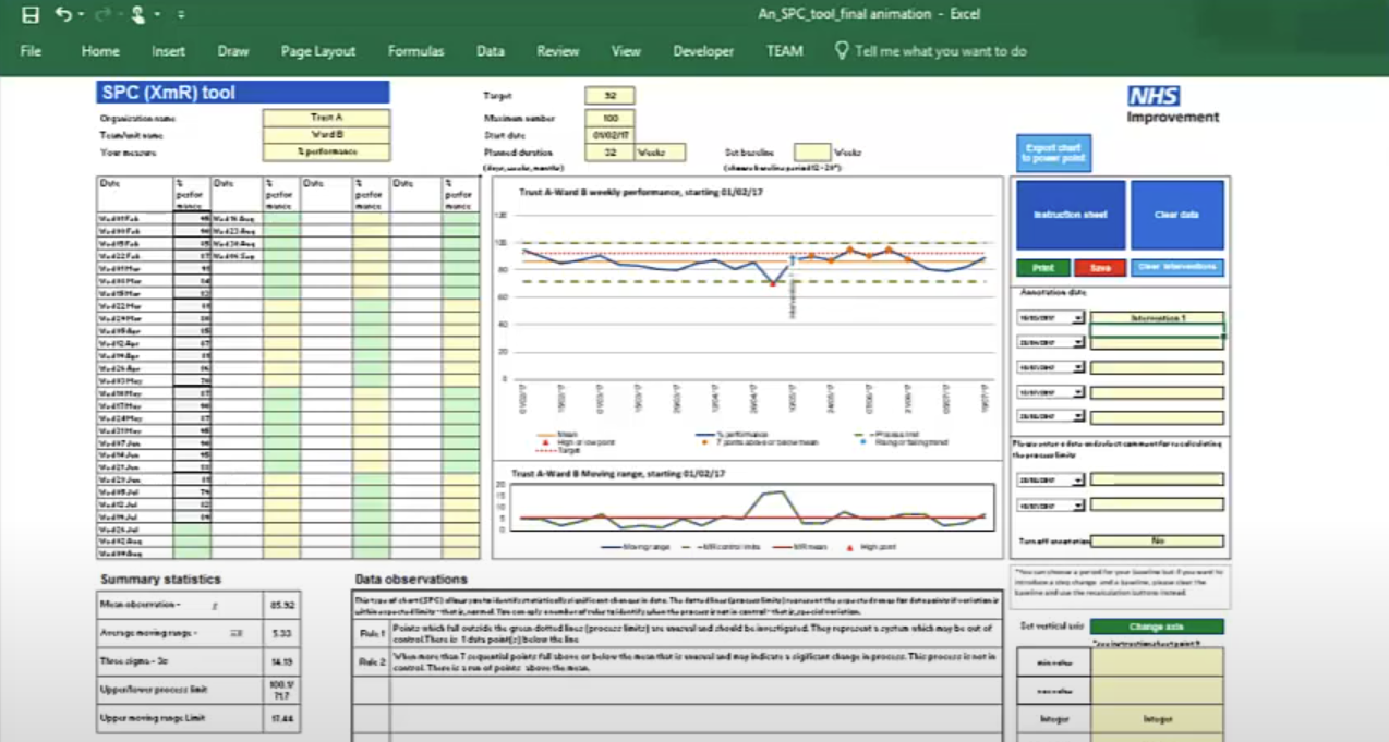
There are separate templates for creating a single SPC chart at a time or creating up to 25 SPC charts at a time.
This video covers the use of the single plot tool.
More about SPC charts
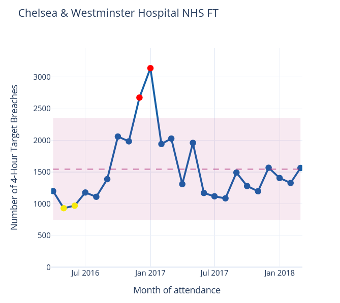
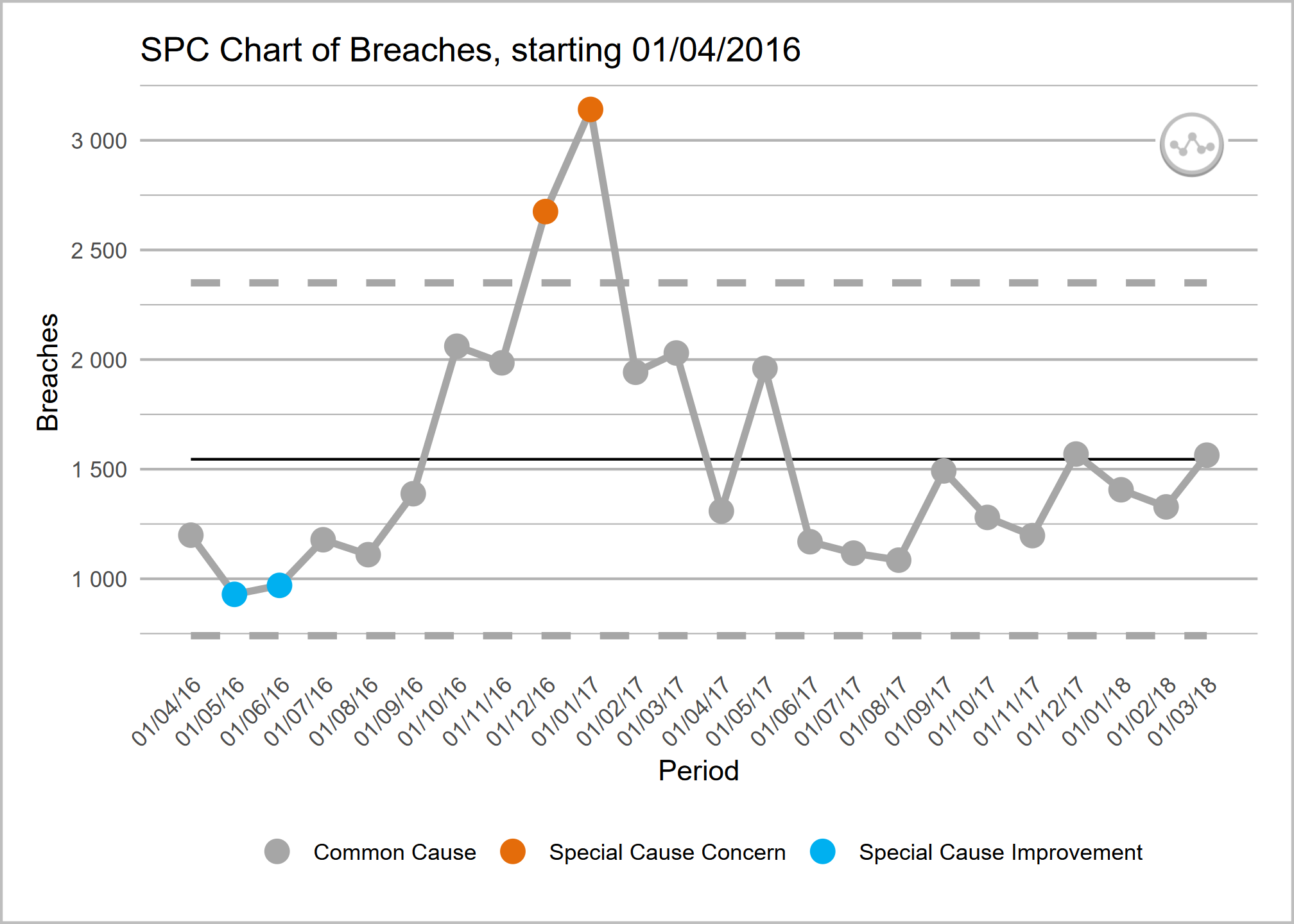
Take a look at our technique page for more information about the theory behind SPC charts.
Looking for some code snippets? Head to our graph page.
Related Projects
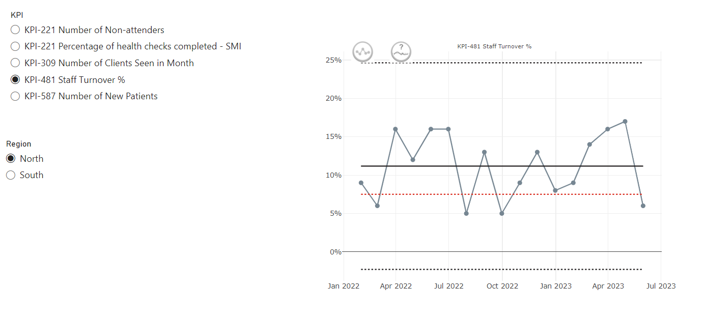
This custom PowerBI visual (based on NHSRplotthedots) simplifies the creation and automation of statistical process control (SPC) charts for KPIs. It helps analysts and teams move beyond static KPIs to understand true performance variation and identify opportunities for improvement, producing R-backed visuals within the setting of PowerBI and integrating with PowerBIs data model and filters.
NHSpy-plotthedots is a Python port of the NHSRplotthedots package that simplifies the creation and automation of statistical process control (SPC) charts for KPIs. It helps analysts and teams move beyond static KPIs to understand true performance variation and identify opportunities for improvement.
NHSRplotthedots is an R package that simplifies the creation and automation of statistical process control (SPC) charts for KPIs. It helps analysts and teams move beyond static KPIs to understand true performance variation and identify opportunities for improvement.