This visual, like the R package it is based on, supports the NHSE/I programme ‘Making Data Count’, and allows users to draw XmR charts, use change points, and apply rules with summary indicators for when rules are breached.
As it is a standalone custom PowerBI visual, rather than an R script, you get an interactive graph that users can hover over to obtain more information about individual points.
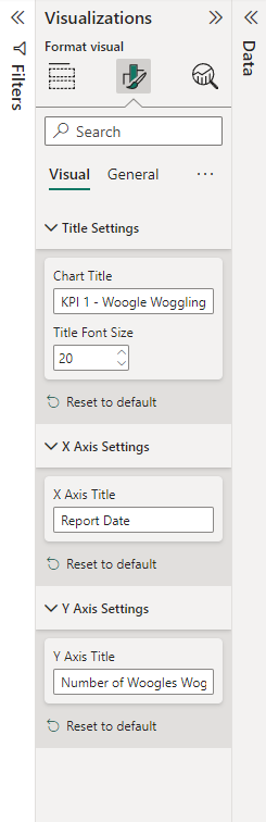
The relevant variables from datasets can be dragged in to the PowerBI interface.
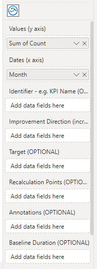
It is then possible to set things like a plot title and axis settings via the interface.
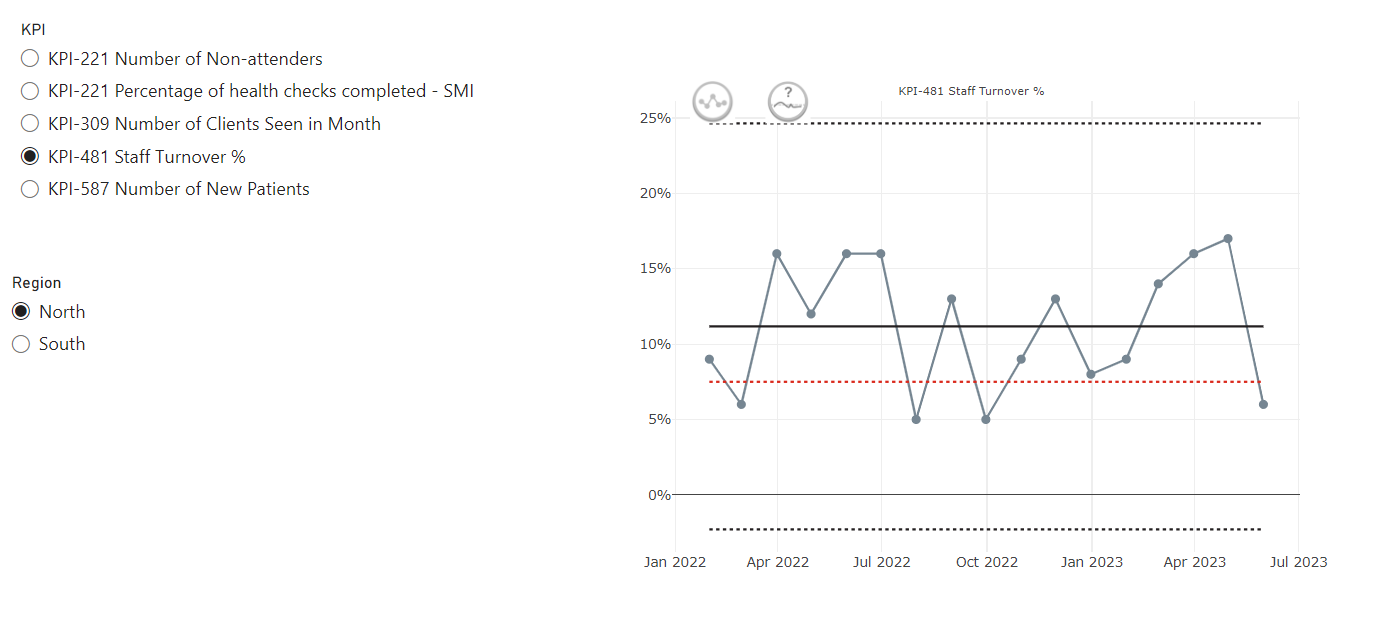
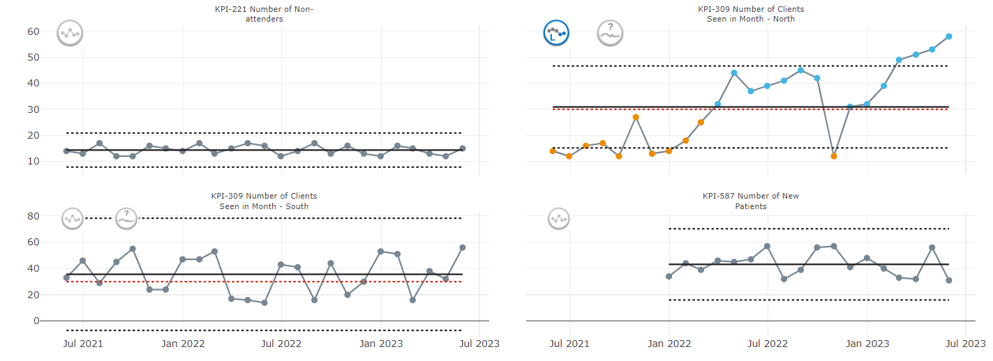
There are a range of different options for displaying the SPC chart.
Single Plot
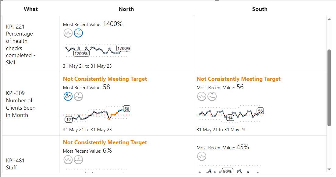
Faceted Plot
This is particularly useful if you are filtering and different groups may have a different number of KPIs to plot
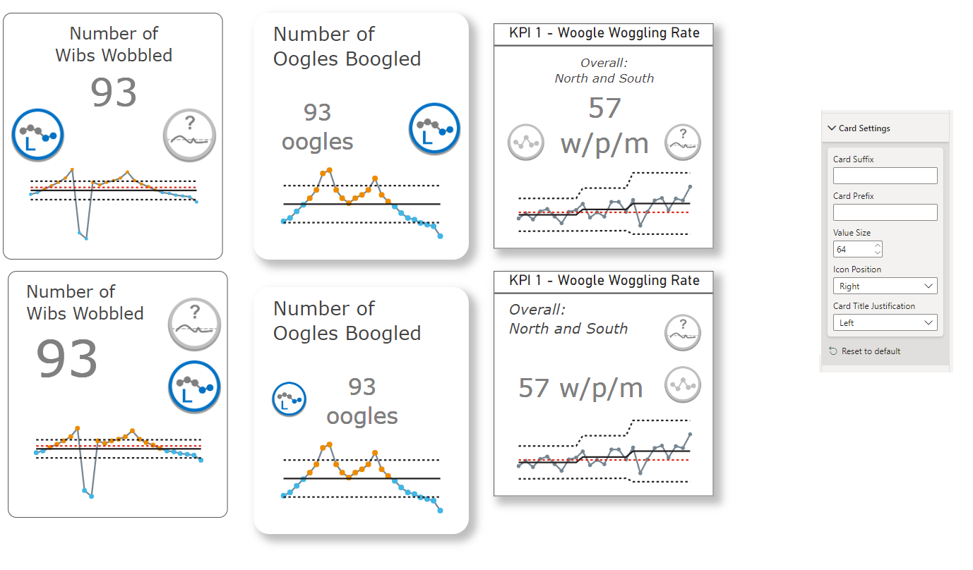
Cards
In place of a metric card that only gives a current value, these cards provide the variation icon, the target icon (if relevant), and a sparkline. Users can then choose a title and subtitle for the card.
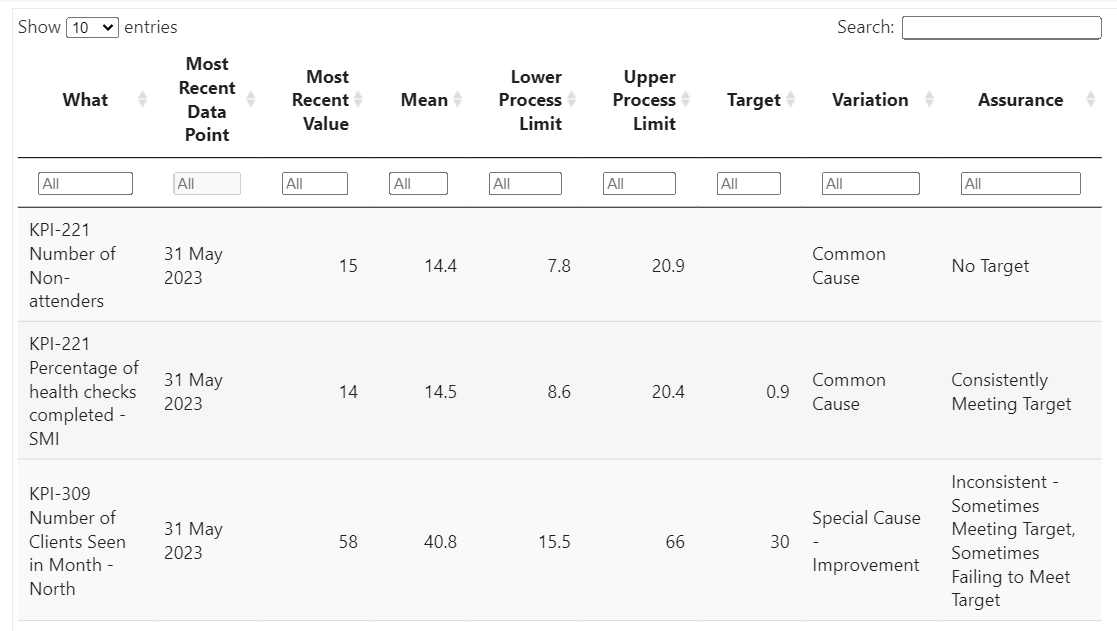
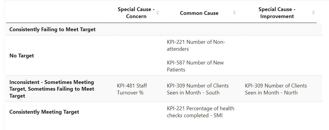
Summary Tables and Matrices
For a high level overview of multiple metrics, you can use one of the summary table or matrix layouts.
More about SPC charts
Take a look at our technique page for more information about the theory behind SPC charts.
Looking for some code snippets? Head to our graph page.
Related Projects
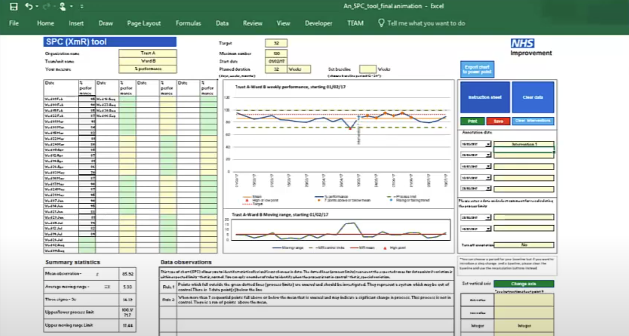
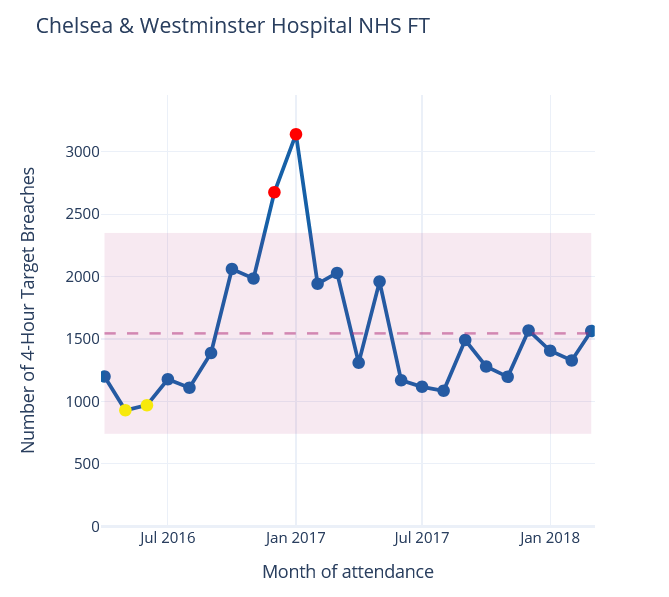
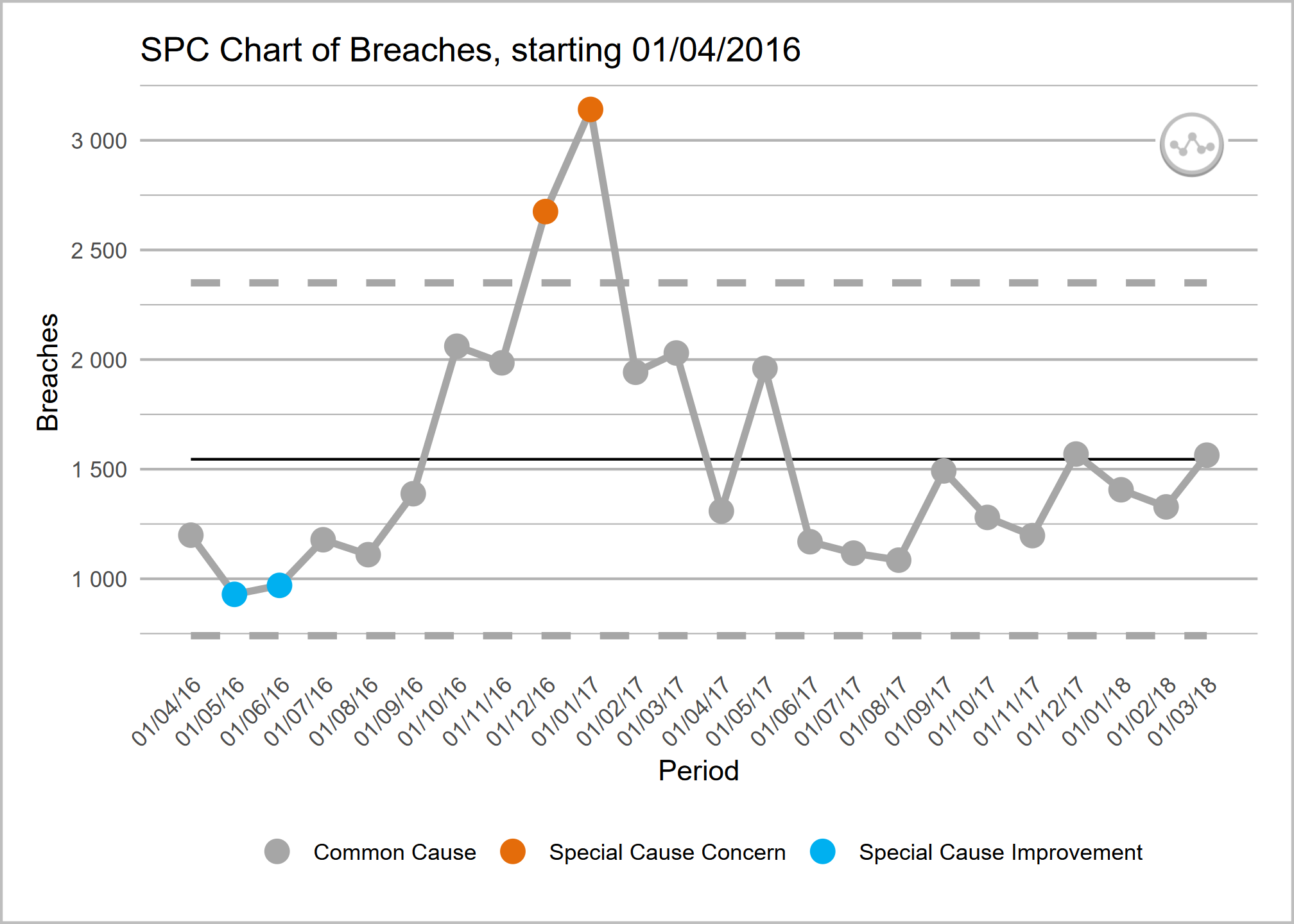
These Excel templates support the creation of statistical process control (SPC) charts adhering to the making data count rules and style. SPC charts are a good alternative to red-amber-green (RAG) rated reporting of metrics, helping to build a more informed picture of a metric's performance over time and spot signals of improvement or deterioration.
NHSpy-plotthedots is a Python port of the NHSRplotthedots package that simplifies the creation and automation of statistical process control (SPC) charts for KPIs. It helps analysts and teams move beyond static KPIs to understand true performance variation and identify opportunities for improvement.
NHSRplotthedots is an R package that simplifies the creation and automation of statistical process control (SPC) charts for KPIs. It helps analysts and teams move beyond static KPIs to understand true performance variation and identify opportunities for improvement.