Find out more about the technique in the Atlas entry here.
The most popular solution for SPC charts in R is the NHSRplotthedots package.
You can find out more about the package in the Atlas entry here
Below is a sample code snippet that makes an SPC chart for a time series.
First, we import our NHS R plot the dots package.
In this case, rather than using real data, we’ll be using a sample dataset of ED attendances provided by the NHSRdatasets library package.
Now we’ll filter our dataset down to just one organisation, type 1 attendances only, and a shorter period of time.
We can take this subset of data and use the NHSRplotthedots library.
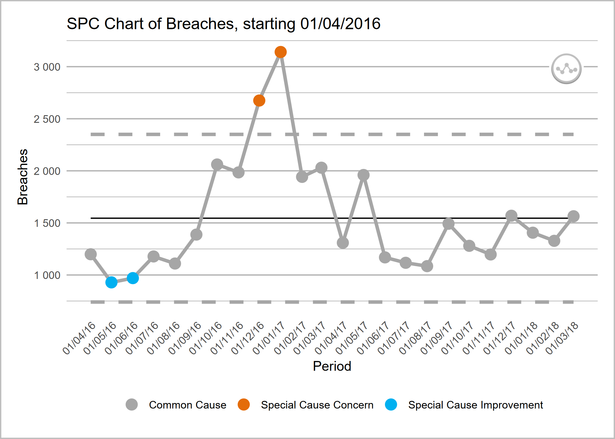
Code Source: NHSR Plot the Dots Documentation @ https://nhsrplotthedots.nhsrcommunity.com/
install.packages("NHSRplotthedots")
install.packages("NHSRdatasets")

library(NHSRdatasets)

library(NHSRplotthedots)
library(dplyr)

sub_set <- ae_attendances |>
  filter(org_code == "RQM", type == 1, period < as.Date("2018-04-01"))

sub_set |>
  NHSRplotthedots::ptd_spc(
    value_field = breaches,
    date_field = period,
    improvement_direction = "decrease"
  ) |>
  NHSRplotthedots::ptd_create_ggplot(
    y_axis_label = "4-hour wait breaches",
    main_title = "SPC of A&E waiting time breaches for RQM"
)There is not currently an actively maintained, production-ready equivalent to the NHS R plot the dots programme.
One of the major benefits of the NHS-aligned packages are that they use the recognised , as well as ‘making data count’ defaults for values such as the number of points that are considered a run.
You may wish to consider reviving a project such as nhspy-plotthedots.
The Making Data Count Excel Templates
You can find out more about the Excel tool in the Atlas entry here
An R-Powered PowerBI Custom Visual
You can find out more about the custom visual in the Atlas entry here